DIVE - Typography Design & Application
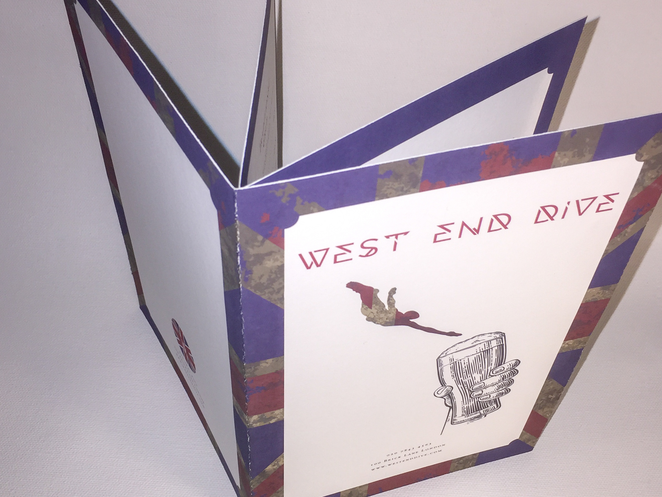
The objective of this project is to create a new, original, expressive, typeface. The key message of this font is to be an expressive typeface design with an angular, geometric, retro futuristic aesthetic. The retro futuristic aesthetic is one that reverberates from the steampunk to science fiction era of print and film from the sixties to the seventies with a slight hint of art deco throughout. The font’s name is Dive and is currently a single weight, uppercase only offering, that is supported by the essential decimal digits, punctuations, symbols, and currency marks. The decimal digits were designed in a classical rounded tabular format as accessories to the letter glyphs not as cohesively competing forms. A total of 113 glyphs were created for Dive.
Dive’s first inspiration originated from the red and white diver down flags seen used by scuba divers. Abstracting from the contrast and angular nature of this long known sign, Dive grew to be a cohesive grouping of glyphs showcasing its repeated angles and shapes. As the process of creating Dive progressed, inspiration was taken from the classical typefaces of Neo Futura, Bifur, and Patrona Grotesk. These typefaces did not offer exact shapes or angles, but were a muse-like influence to the geometric possibilities within the glyph creation process.
Typography Specimen - DIVE - A single weight, geometric expressive font, uppercase only, created for a retro futuristic aesthetic. Digitally designed with Glyphs.
