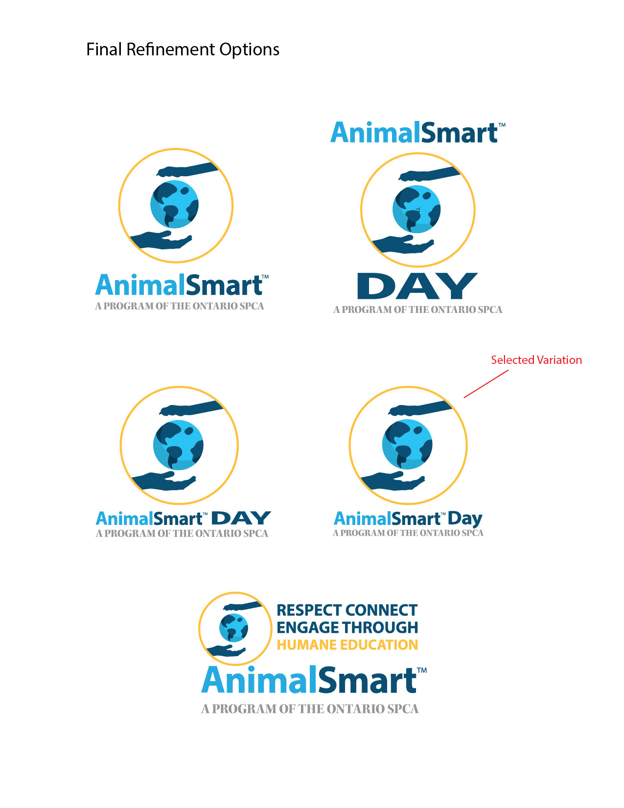
Final Options from refinement discussions
Logo banners used on email blast

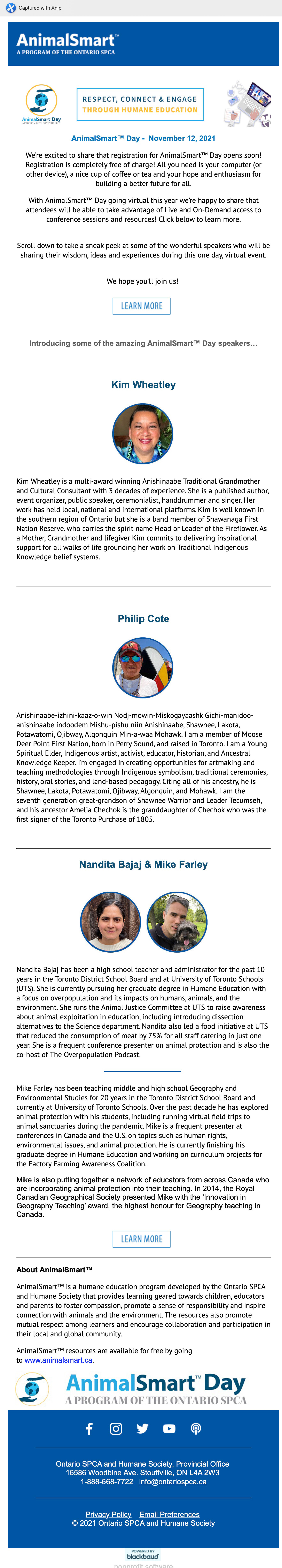
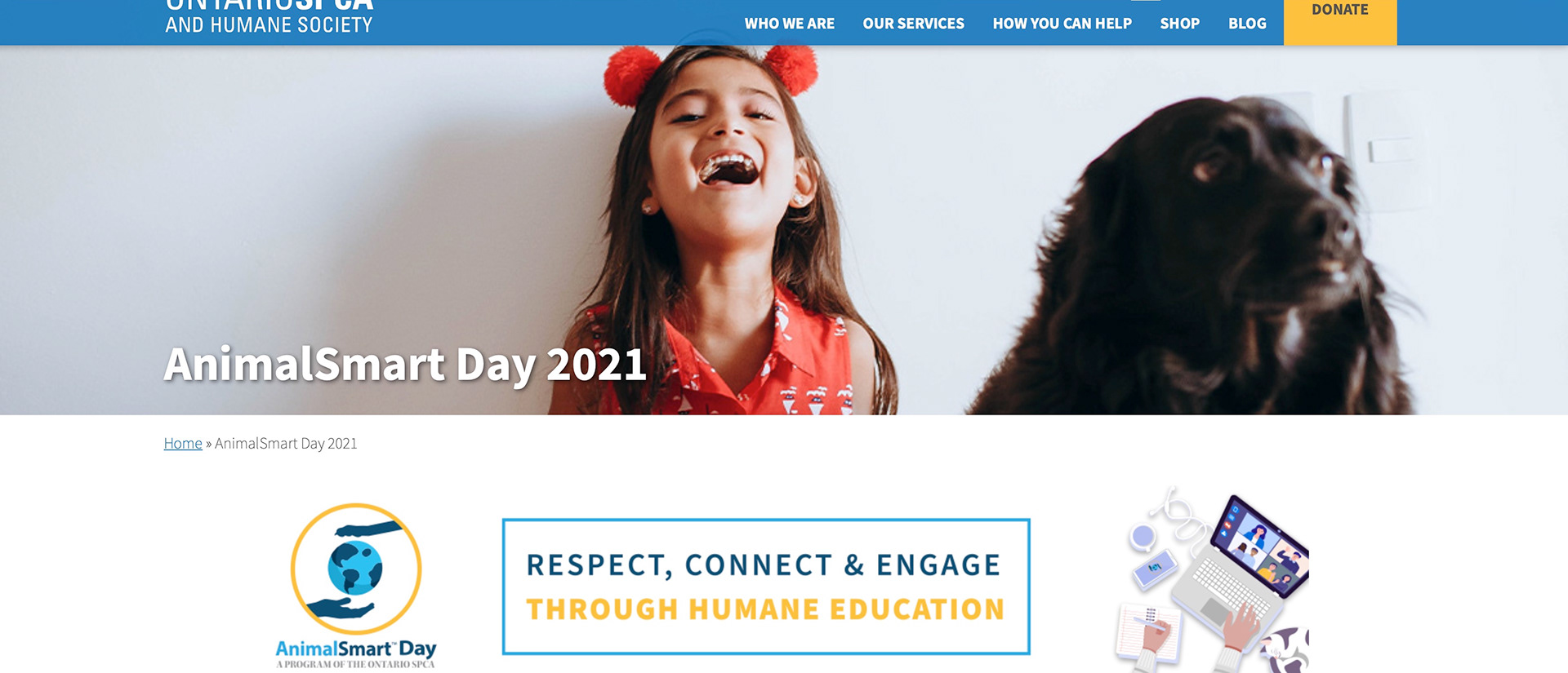
Website for Animal Smart Day

Facebook Use

Context
To create a new logo representing the Animal Smart Day Conference which ties in with the OSPCA visual identity and humane education goals, particularly as it relates to bringing awareness to the importance of the human-animal bond from a global perspective. This is a new virtual conference offering due to COVID restrictions in support of the continued launch of the Animal Smart educational programs. These programs target the audience of elementary, secondary, and post-secondary instructors who will then integrate program knowledge into their in-class curriculum.
Method
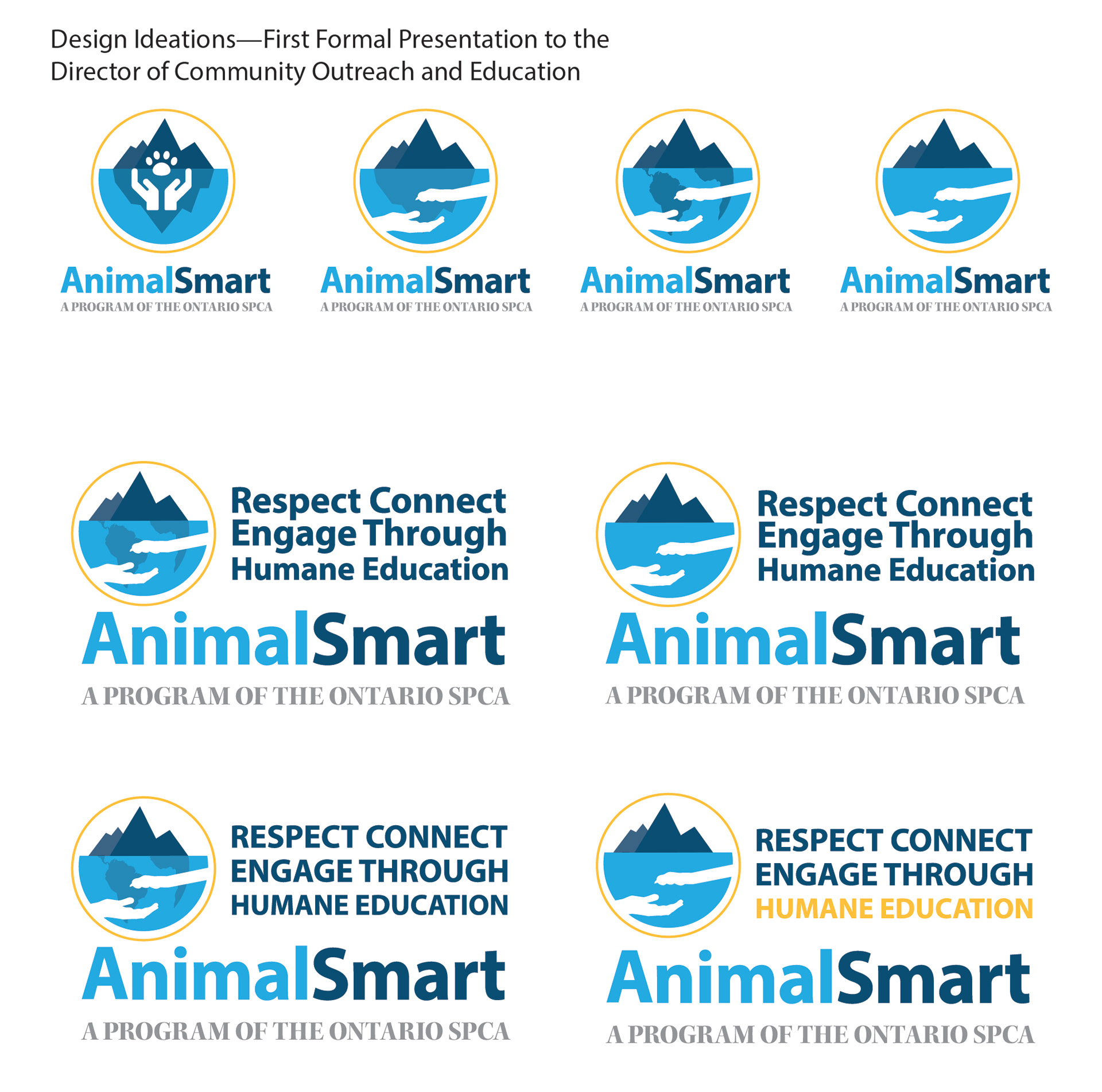
Research the existing OSPCA Website, available online supporting documents for existing visuals and graphic systems. Identify and create the OSPCA colour palette to be used in the final design. Multiple interviews with the Humane Education Manager to identify expectations, interests, and wants. (Humane Education Manager reported directly to the Director of Community Outreach and Education for final design acceptance). Investigations found the need for a complete logo system, including a new primary logo brandmark integrated with an existing supporting secondary word mark and tagline with multiple variations for optimal media use. Through interviews, emphasis was placed on simplicity and prominent visuals with less abstract or symbolic graphic representation. I tried to sell a balance of the idea of visual problem solving, allowing for a minimal but unique brand mark (not liked). A vital note was made to tie ins to the indigenous speaker component concerning environmental and spiritual connection to the land and animals (see list below). Spring 2021 Change for Animals day logo represented animals surrounded by human-like hands (not what they want, they want an environmental tie-in and a less confining/controlling feel).
Points of interest voiced: paws, hands, hearts, humans and animals (multiple species represented), physical contact, holding, hugging, touching, sky, grass, globes, North America map graphics, outdoors, comfort, protection, care, One Welfare, Human, Animal, Environment.
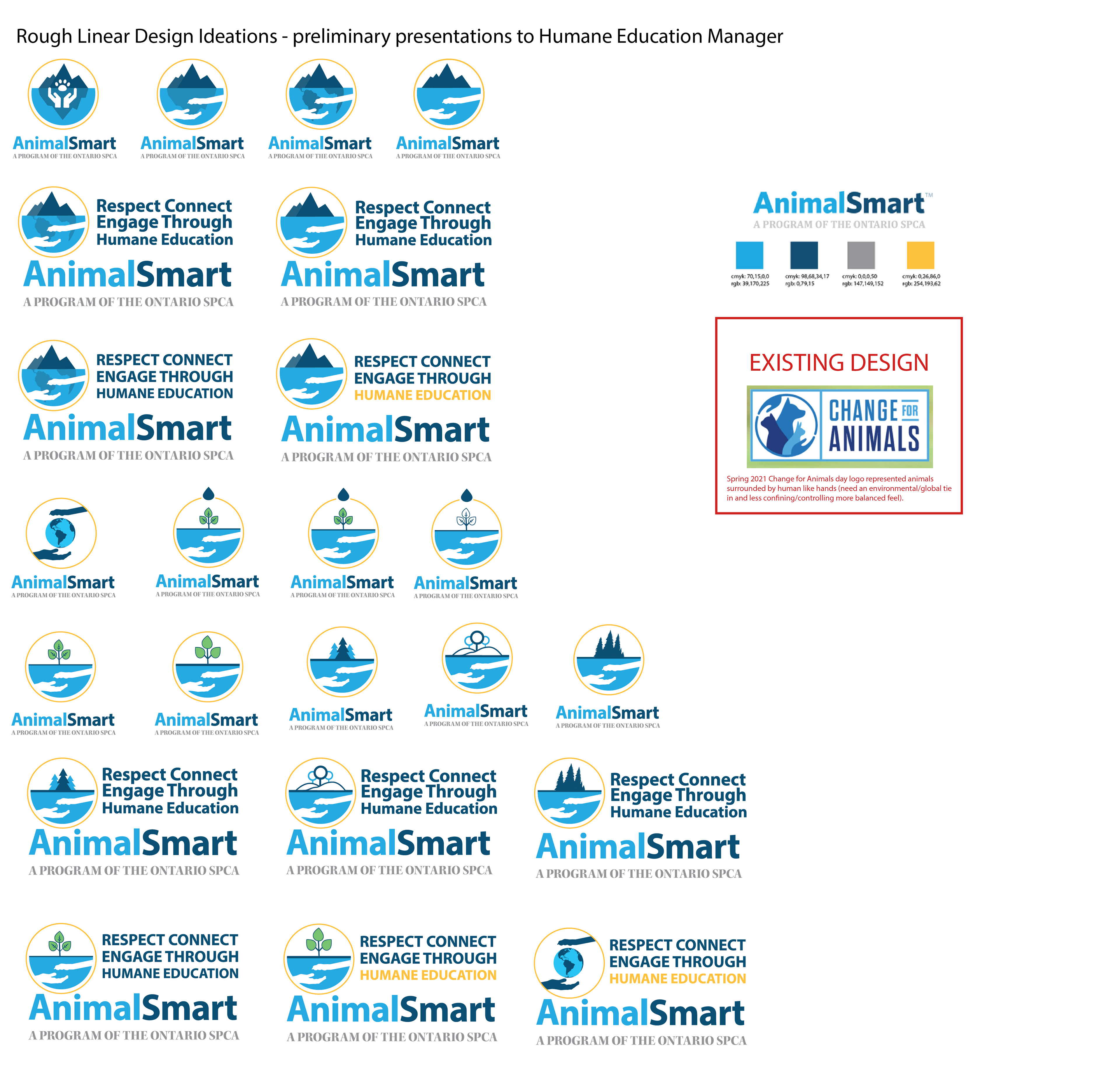
Design Process
A focus was kept on simplicity and prominent visuals with less abstract or symbolic graphic representation. I received feedback and suggestions from the OSPCA, the Humane Education Manager, and other stakeholders throughout the design process. Working to incorporate this feedback, I ensured that the final logo design met all the requirements and expectations of the stakeholders involved.
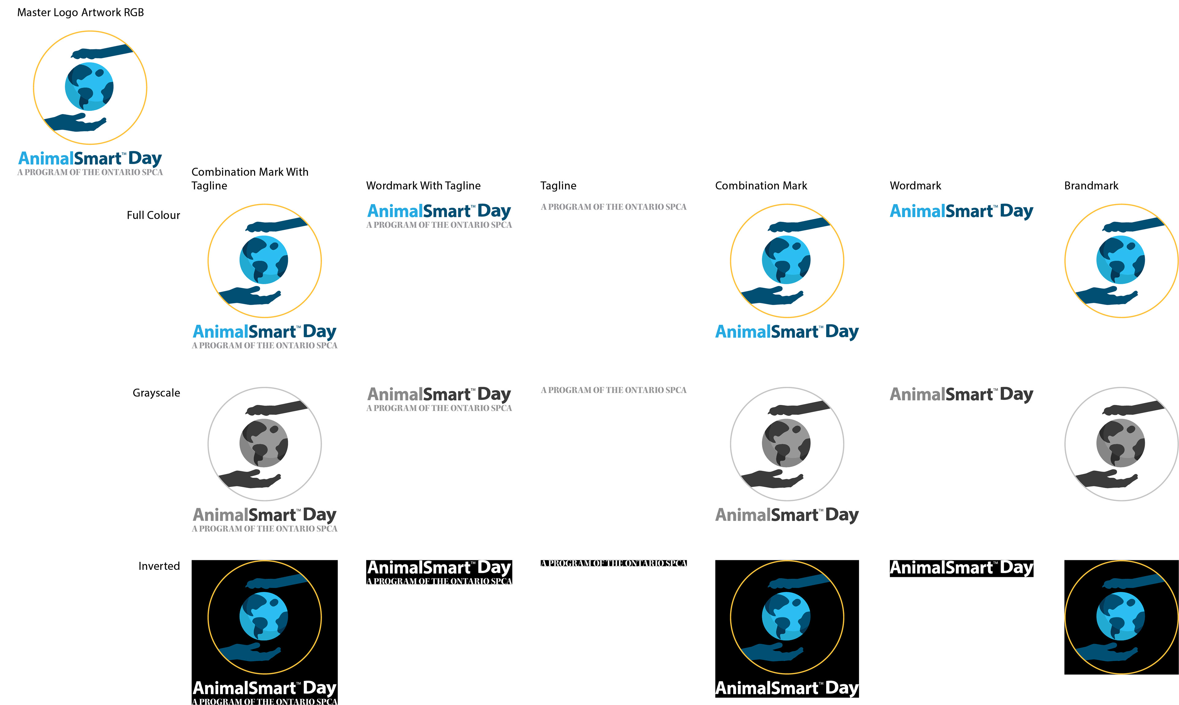
Solution
Logo package with a visual map of choices available in the package folder tree.
Results
Upon final acceptance of the completed logo packages, the OSPCA was given three future minor logo tweaks in the form of size, colour, or usage-driven requests. Over the time between mid-summer completion and the November conference launch, two of these requests were made for assistance with a profile logo size simplification and an email signature variation. On another occasion, IT requested a splash and footer variation for the web.